前言
好久不见,各位大佬们,上一次写 Jetpack Compose 的内容好像已经是 9 个多月前的事了。
昨日看 Google I/O 2024 内容时,惊喜的发现,Compose 终于添加了对共享元素动画的支持,等了一年多了,终于来了。
那还等什么,马上去试试啊!
简单的共享元素效果
简介和前期准备
截止本文写作时,Compose 的共享元素动画还处于 beta 阶段,在 Compose 1.7.0-beta01 及其更新版本中才能使用。
所以我们需要手动更改 Compose 的依赖版本为最新测试版。
共享元素动画在 Compose 的 Animation 包中提供,我们添加 1.7.0-beta01 版本的 Compose Animation:
implementation "androidx.compose.animation:animation:1.7.0-beta01"
现在,我们就可以愉快的使用共享元素过渡动画了。
基本方法
共享元素动画有三个核心的 API:
SharedTransitionLayout从名字就可以看出,这是个 “Layout” ,没错,我们需要把它作为需要添加共享元素动画的页面或者 Composable 组件的顶级布局。该布局提供了SharedTransitionScope作用域,共享元素动画相关的 API 需要在该作用域中才能使用。sharedElement()这是个 Modifier 扩展函数,需要在SharedTransitionScope中使用,用于标记需要“共享”的元素。sharedBounds()这是个 Modifier 扩展函数,需要在SharedTransitionScope中使用,类似于sharedElement(),但是不同于sharedElement()的标记目标是元素,sharedBounds()的标记目标是容器边界。
sharedElement 或者 sharedBounds 有两个必须的参数: state 和 animatedVisibilityScope 。
其中 state 类型为 SharedContentState 用于标记共享状态,这个状态在 SharedTransitionScope 作用域中提供,通常使用 rememberSharedContentState(key = "anyKey") 创建,必须提供一个 Key ,该 key 用于匹配两个共享元素,同时如果有多组共享动画的话,这个 key 需要具有唯一性。
另一个 animatedVisibilityScope 则为 AnimatedVisibilityScope 作用域,用于实现动画效果,我们可以自行处理这个动画效果,也可以让其自动处理。
当然,最方便的还是让 sharedElement 或者 sharedBounds 自动处理动画,因此我们需要将其放置于 AnimatedContent 或者 AnimatedVisibility 中,他们都提供了 AnimatedVisibilityScope 。
sharedElement
综上,我们可以写出一个非常简单的共享元素 demo:
@OptIn(ExperimentalSharedTransitionApi::class)
@Composable
fun ShareContentScreen() {
    var showDetails by remember {
        mutableStateOf(false)
    }

    SharedTransitionLayout {
        AnimatedContent(
            showDetails,
            label = "basic_transition"
        ) { targetState ->
            if (!targetState) {
                MainContent(
                    onShowDetails = {
                        showDetails = true
                    },
                    animatedVisibilityScope = this@AnimatedContent,
                    sharedTransitionScope = this@SharedTransitionLayout
                )
            } else {
                DetailsContent(
                    onBack = {
                        showDetails = false
                    },
                    animatedVisibilityScope = this@AnimatedContent,
                    sharedTransitionScope = this@SharedTransitionLayout
                )
            }
        }
    }
}

@OptIn(ExperimentalSharedTransitionApi::class)
@Composable
private fun MainContent(
    onShowDetails: () -> Unit,
    sharedTransitionScope: SharedTransitionScope,
    animatedVisibilityScope: AnimatedVisibilityScope
) {
    Row {
        with(sharedTransitionScope) {
            Image(
                painter = painterResource(id = R.drawable.ic_launcher_background),
                contentDescription = "icon",
                modifier = Modifier
                    .sharedElement(
                        rememberSharedContentState(key = "image"),
                        animatedVisibilityScope = animatedVisibilityScope
                    )
                    .size(100.dp)
                    .clip(CircleShape)
                    .clickable(onClick = onShowDetails),
                contentScale = ContentScale.Crop
            )
        }
    }
}

@OptIn(ExperimentalSharedTransitionApi::class)
@Composable
private fun DetailsContent(
    onBack: () -> Unit,
    sharedTransitionScope: SharedTransitionScope,
    animatedVisibilityScope: AnimatedVisibilityScope
) {
    Column(
        horizontalAlignment = Alignment.CenterHorizontally,
        verticalArrangement = Arrangement.Center,
    ) {
        with(sharedTransitionScope) {
            Image(
                painter = painterResource(id = R.drawable.ic_launcher_background),
                contentDescription = "icon",
                modifier = Modifier
                    .sharedElement(
                        rememberSharedContentState(key = "image"),
                        animatedVisibilityScope = animatedVisibilityScope
                    )
                    .size(200.dp)
                    .clip(CircleShape)
                    .clickable(onClick = onBack),
                contentScale = ContentScale.Crop
            )
            Text(text = "假装这个是一个详细页面,并且它的文字真的非常非常非常非常的多,你看多的都需要\n换行了呢")
        }
    }
}
运行效果如下:
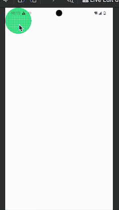
在这个 demo 中,我们共享了 MainContent 和 DetailsContent 中的图片,使其从 MainContent 切换至 DetailsContent 能够以这张图片作为过渡元素展示过渡动画。
sharedBounds
从上面的简介我们可以知道,sharedBounds 和 sharedElement 主要区别在于 sharedBounds 用于共享容器边界,其容器形状在视觉上是不同的。
说这么都不够直观,我们直接来改一下上一节中的 demo,看看效果:
@OptIn(ExperimentalSharedTransitionApi::class)
@Composable
fun ShareContentScreen() {
    var showDetails by remember {
        mutableStateOf(false)
    }

    SharedTransitionLayout {
        AnimatedContent(
            showDetails,
            label = "basic_transition"
        ) { targetState ->
            if (!targetState) {
                MainContent(
                    onShowDetails = {
                        showDetails = true
                    },
                    animatedVisibilityScope = this@AnimatedContent,
                    sharedTransitionScope = this@SharedTransitionLayout
                )
            } else {
                DetailsContent(
                    onBack = {
                        showDetails = false
                    },
                    animatedVisibilityScope = this@AnimatedContent,
                    sharedTransitionScope = this@SharedTransitionLayout
                )
            }
        }
    }
}

@OptIn(ExperimentalSharedTransitionApi::class)
@Composable
private fun MainContent(
    onShowDetails: () -> Unit,
    sharedTransitionScope: SharedTransitionScope,
    animatedVisibilityScope: AnimatedVisibilityScope
) {
    with(sharedTransitionScope) {
        Row(
            modifier = Modifier
                .sharedBounds(
                    rememberSharedContentState(key = "bounds"),
                    animatedVisibilityScope = animatedVisibilityScope,
                    enter = fadeIn(),
                    exit = fadeOut(),
                    resizeMode = SharedTransitionScope.ResizeMode.ScaleToBounds()
                )
                .padding(8.dp)
                .size(200.dp)
                .background(Color.Blue)
        ) {
            Image(
                painter = painterResource(id = R.drawable.ic_launcher_background),
                contentDescription = "icon",
                modifier = Modifier
                    .size(100.dp)
                    .clip(CircleShape)
                    .clickable(onClick = onShowDetails),
                contentScale = ContentScale.Crop
            )
        }
    }
}

@OptIn(ExperimentalSharedTransitionApi::class)
@Composable
private fun DetailsContent(
    onBack: () -> Unit,
    sharedTransitionScope: SharedTransitionScope,
    animatedVisibilityScope: AnimatedVisibilityScope
) {
    with(sharedTransitionScope) {
        Column(
            horizontalAlignment = Alignment.CenterHorizontally,
            verticalArrangement = Arrangement.Center,
            modifier = Modifier
                .padding(top = 200.dp, start = 16.dp, end = 16.dp)
                .sharedBounds(
                    rememberSharedContentState(key = "bounds"),
                    animatedVisibilityScope = animatedVisibilityScope,
                    enter = fadeIn(),
                    exit = fadeOut(),
                    resizeMode = SharedTransitionScope.ResizeMode.ScaleToBounds()
                )
                .size(500.dp)
                .clip(CircleShape)
                .background(Color.Yellow)
        ) {
            Image(
                painter = painterResource(id = R.drawable.ic_launcher_background),
                contentDescription = "icon",
                modifier = Modifier
                    .size(200.dp)
                    .clip(CircleShape)
                    .clickable(onClick = onBack),
                contentScale = ContentScale.Crop
            )
            Text(text = "假装这个是一个详细页面,并且它的文字真的非常非常非常非常的多,你看多的都需要\n换行了呢")
        }
    }
}
运行效果:
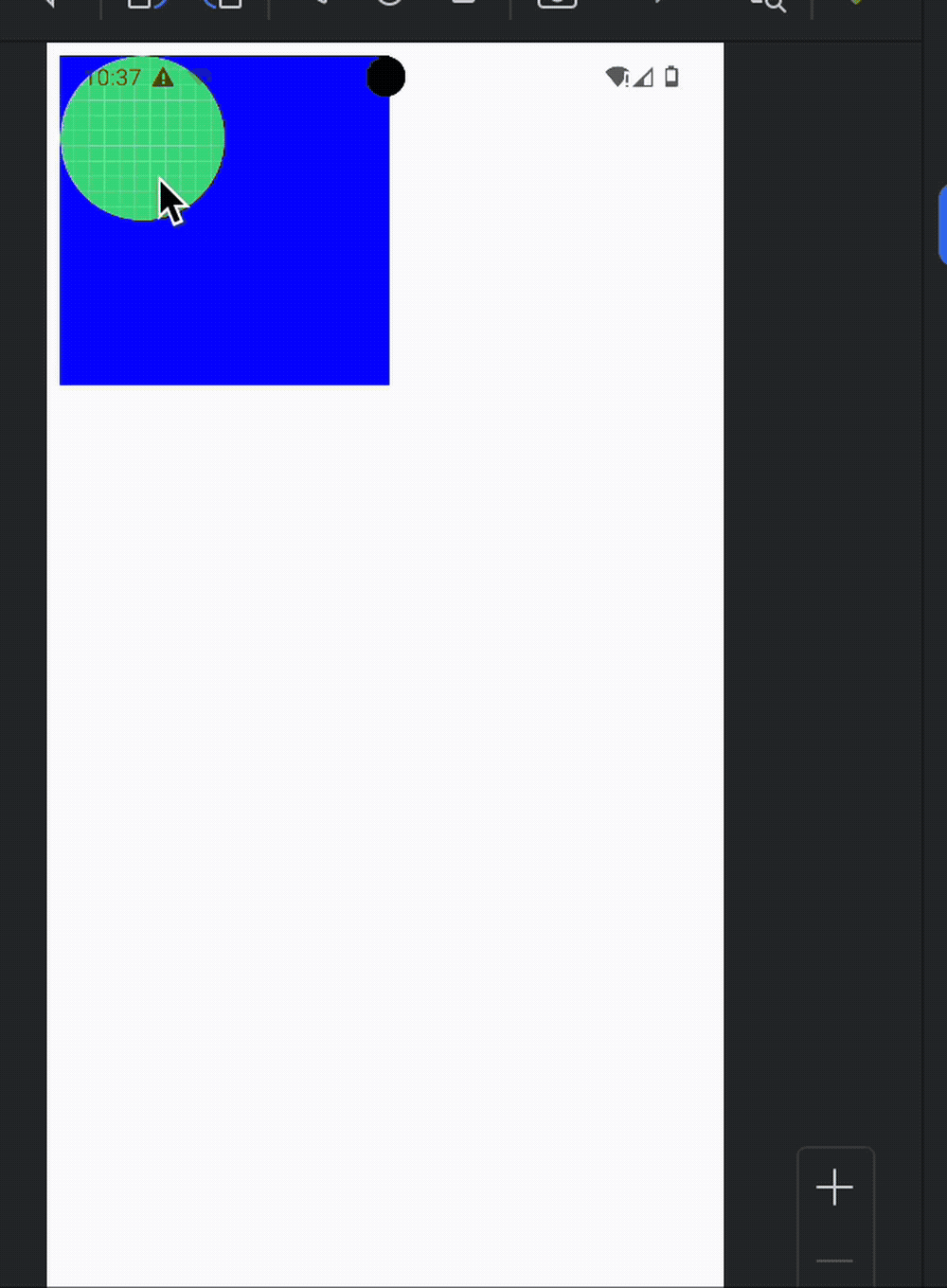
从我们代码中,我们可以看到最直观的变化就是我们将共享边界的标记放到了父级的 Row Column 上,而不是其中的图片上。
同时,为了更直观的展示容器过渡效果,我们还给两个父组件添加了背景颜色。
相对于 sharedElement() ,sharedBounds() 多了几个参数:
enter 和 exit 分别用来设置组件显示和退出时的过渡效果。
resizeMode 用于规定按照什么规则去变化子组件的尺寸。
小结
在这一节中我们简单介绍了简单的使用 sharedElement() 、sharedBounds() 为不同的组件添加共享元素过渡效果,但是实际上共享元素过渡效果在不同页面之间切换用的更多,而在 Compose 中切换不同的页面通常使用的是 “导航” 库来进行,当然,共享元素变化已经支持了“导航”。
在导航中使用共享元素过渡动画
为了在 Compose 中使用导航,我们首先需要引入依赖:
implementation("androidx.navigation:navigation-compose:2.7.7")
然后,和直接使用共享动画相同,我们需要将导航组件 NavHost 置于 SharedTransitionLayout 之下。
不同的是由于导航的 composable 的 content 本身就是处于 AnimatedContentScope 作用域之中,所以我们不需要额外的将其置于 AnimatedContentScope 或 AnimatedVisibilityScope 之中。
因此我们可以写出以下 demo:
val listSnacks: List<Snack> = listOf(
    Snack("Apple", "A sweet red fruit", R.drawable.ic_launcher_background),
    Snack("Banana", "A yellow fruit", R.drawable.ic_launcher_background),
    Snack("Orange", "A orange fruit", R.drawable.ic_launcher_background),
    Snack("Watermelon", "A watermelon fruit", R.drawable.ic_launcher_background),
    Snack("Mango", "A mango fruit", R.drawable.ic_launcher_background),
    Snack("Pineapple", "A pineapple fruit", R.drawable.ic_launcher_background),
    Snack("Strawberry", "A strawberry fruit", R.drawable.ic_launcher_background),
    Snack("Cherry", "A cherry fruit", R.drawable.ic_launcher_background),
    Snack("Grapes", "A grapes fruit", R.drawable.ic_launcher_background),
    Snack("Kiwi", "A kiwi fruit", R.drawable.ic_launcher_background),
    Snack("Peach", "A peach fruit", R.drawable.ic_launcher_background),
    Snack("Pear", "A pear fruit", R.drawable.ic_launcher_background),
    Snack("Raspberry", "A raspberry fruit", R.drawable.ic_launcher_background),
    Snack("Blueberry", "A blueberry fruit", R.drawable.ic_launcher_background),
    Snack("Lemon", "A lemon fruit", R.drawable.ic_launcher_background),
    Snack("Tangerine", "A tangerine fruit", R.drawable.ic_launcher_background),
    Snack("Avocado", "An avocado fruit", R.drawable.ic_launcher_background),
    Snack("Coconut", "A coconut fruit", R.drawable.ic_launcher_background),
)

@Preview
@Composable
fun SharedElement_PredictiveBack() {
    SharedTransitionLayout {
        val navController = rememberNavController()
        NavHost(
            navController = navController,
            startDestination = "home"
        ) {
            composable("home") {
                HomeScreen(
                    navController,
                    this@SharedTransitionLayout,
                    this@composable
                )
            }
            composable(
                "details/{item}",
                arguments = listOf(navArgument("item") { type = NavType.IntType })
            ) { backStackEntry ->
                val id = backStackEntry.arguments?.getInt("item")
                val snack = listSnacks[id!!]
                DetailsScreen(
                    navController,
                    id,
                    snack,
                    this@SharedTransitionLayout,
                    this@composable
                )
            }
        }
    }
}

@Composable
private fun DetailsScreen(
    navController: NavHostController,
    id: Int,
    snack: Snack,
    sharedTransitionScope: SharedTransitionScope,
    animatedContentScope: AnimatedContentScope
) {
    with(sharedTransitionScope) {
        Column(
            Modifier
                .fillMaxSize()
                .clickable {
                    navController.navigate("home")
                }
        ) {
            Image(
                painterResource(id = snack.image),
                contentDescription = snack.description,
                contentScale = ContentScale.Crop,
                modifier = Modifier.Companion
                    .sharedElement(
                        sharedTransitionScope.rememberSharedContentState(key = "image-$id"),
                        animatedVisibilityScope = animatedContentScope
                    )
                    .aspectRatio(1f)
                    .fillMaxWidth()
            )
            Text(
                snack.name, fontSize = 18.sp,
                modifier =
                Modifier.Companion
                    .sharedElement(
                        sharedTransitionScope.rememberSharedContentState(key = "text-$id"),
                        animatedVisibilityScope = animatedContentScope
                    )
                    .fillMaxWidth()
            )
        }
    }

}

@Composable
private fun HomeScreen(
    navController: NavHostController,
    sharedTransitionScope: SharedTransitionScope,
    animatedContentScope: AnimatedContentScope
) {
    LazyColumn(
        modifier = Modifier
            .fillMaxSize()
            .padding(8.dp),
        verticalArrangement = Arrangement.spacedBy(8.dp)
    ) {
        itemsIndexed(listSnacks) { index, item ->
            Row(
                Modifier.clickable {
                    navController.navigate("details/$index")
                }
            ) {
                Spacer(modifier = Modifier.width(8.dp))
                with(sharedTransitionScope) {
                    Image(
                        painterResource(id = item.image),
                        contentDescription = item.description,
                        contentScale = ContentScale.Crop,
                        modifier = Modifier.Companion
                            .sharedElement(
                                sharedTransitionScope.rememberSharedContentState(key = "image-$index"),
                                animatedVisibilityScope = animatedContentScope
                            )
                            .size(100.dp)
                    )
                    Spacer(modifier = Modifier.width(8.dp))
                    Text(
                        item.name, fontSize = 18.sp,
                        modifier = Modifier
                            .align(Alignment.CenterVertically)
                            .sharedElement(
                                sharedTransitionScope.rememberSharedContentState(key = "text-$index"),
                                animatedVisibilityScope = animatedContentScope,
                            )
                    )
                }
            }
        }
    }
}

data class Snack(
    val name: String,
    val description: String,
    @DrawableRes val image: Int
)
运行效果:

在这个 demo 中我们主页面是一个 LazuColumn 列表,点击列表项后导航到新的详情页面,在这个 demo 中我们同时设置了两组共享元素,即列表页的图片和详情页面的图片为一组,列表页的标题文字和详情页的描述文字作为一组来实现过渡效果。
为了保证动画的准确,我们在标记共享元素时给不同的列表项图片按照列表索引传递了不同的 key : image-$index,文字也是:text-$index。
然后在跳转至详情页面时将 index 作为路由参数传递给新页面,并在新页面中设置相应的 key。
实践
上面的 demo 基本都是来自谷歌的官方文档然后略微修改了一下。
实际项目中的情况肯定是会比 demo 中要复杂一点,所以本文的最后我们来看一个实例。
这次修改用很久以前写的一个 Compose 项目 GiteeTodo 举例子。
在这个项目中有个类似于上述 demo 的列表展示当前的 TODO ,点击之后会跳转到 TODO 详情。
因为这个项目的 TODO 没有图片,所以我们直接使用它的标题作为共享元素。
在添加共享元素过渡动画前,它的切换页面效果是这样的:
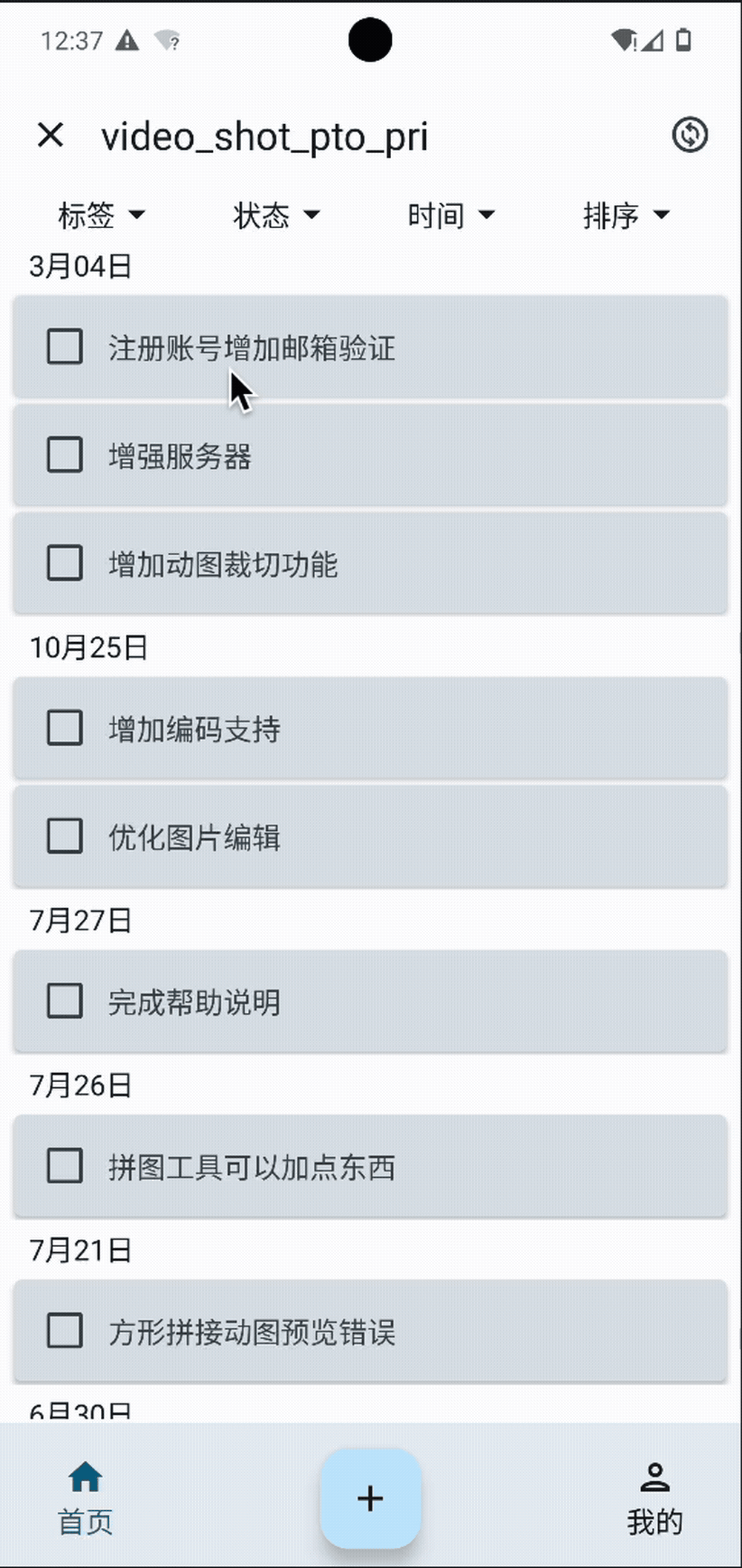
可以看到其实我给它加了个简单的由上至下的切换动画效果。
再来看看改成使用共享元素动画之后的效果:

是不是感觉好看多了?
那么,现在我们就开始将这个动画转为使用共享元素动画吧。
首先,更改我们的导航路由定义,
从:
@Composable
fun HomeNavHost() {
    val navController = rememberNavController()
    NavHost(navController, Route.LOGIN) {
        composable("${Route.TODO_DETAIL}/{${RouteParams.PAR_ISSUE_NUM}}",
            arguments = listOf(
                navArgument(RouteParams.PAR_ISSUE_NUM) {
                    type = NavType.StringType
                    nullable = true}
            ),
            enterTransition = {
                slideIntoContainer(AnimatedContentTransitionScope.SlideDirection.Down, animationSpec = tween(700))
            },
            exitTransition = {
                slideOutOfContainer(AnimatedContentTransitionScope.SlideDirection.Up, animationSpec = tween(700))
            }
        ) {
            val argument = requireNotNull(it.arguments)
            val issueNum = argument.getString(RouteParams.PAR_ISSUE_NUM) ?: "null"
            Column(Modifier.systemBarsPadding()) {
                TodoDetailScreen(navController, issueNum)
            }
        }

    }
}
改为:
@Composable
fun HomeNavHost() {
    SharedTransitionLayout {
        val navController = rememberNavController()
        NavHost(navController, Route.LOGIN) {
            composable("${Route.TODO_DETAIL}/{${RouteParams.PAR_ISSUE_NUM}}/{${RouteParams.PAR_ISSUE_TITLE}}",
                arguments = listOf(
                    navArgument(RouteParams.PAR_ISSUE_NUM) {
                        type = NavType.StringType
                        nullable = true
                    },
                    navArgument(RouteParams.PAR_ISSUE_TITLE) {
                        type = NavType.StringType
                        nullable = true
                    }
                ),
            ) {
                val argument = requireNotNull(it.arguments)
                val issueNum = argument.getString(RouteParams.PAR_ISSUE_NUM) ?: "null"
                val issueTitle = argument.getString(RouteParams.PAR_ISSUE_TITLE)
                Column(Modifier.systemBarsPadding()) {
                    TodoDetailScreen(navController, issueNum, issueTitle, this@SharedTransitionLayout, this@composable)
                }
            }

        }
    }
}
注意这里我们将共享元素作用域 SharedTransitionScope 和 动画作用域AnimatedContentScope 通过参数传递给了 TodoDetailScreen ,即我们的 TODO 详情页面。
然后在 TodoDetailScreen 中共享元素加上 sharedElement() 修饰符:
// ……

    with(sharedTransitionScope) {
        OutlinedTextField(
            value = viewState.title,
            onValueChange = { viewModel.dispatch(TodoDetailViewAction.OnTitleChange(it)) },
            readOnly = !viewState.isEditAble,
            label = { Text("标题")},
            modifier = Modifier
                .sharedElement(
                    sharedTransitionScope.rememberSharedContentState(key = "${ShareElementKey.TODO_ITEM_TITLE}_${issueNum}"),
                    animatedVisibilityScope = animatedContentScope
                )
                .fillMaxWidth()
                .padding(2.dp)
                .background(MaterialTheme.colorScheme.background)
        )

        // ……

    }
同理,在列表页面 TodoListScreen 加上共享元素修饰:
    Card(
        modifier = Modifier
            .fillMaxWidth()
            .padding(8.dp, 2.dp)
            .background(MaterialTheme.colorScheme.background)
            .placeholder(visible = isLoading, highlight = PlaceholderHighlight.fade()),
        shape = RoundedCornerShape(4.dp),
        elevation = CardDefaults.cardElevation(
            defaultElevation = 2.dp
        )
    ) {
        Column(Modifier.padding(4.dp)) {
            Row(
                verticalAlignment = Alignment.CenterVertically,
                modifier = Modifier.padding(end = 8.dp)
            ) {
            // ……
                with(sharedTransitionScope) {
                    Text(
                        text = itemData.title,
                        textDecoration = if (itemData.state == IssueState.REJECTED) TextDecoration.LineThrough else null,
                        maxLines = 1,
                        overflow = TextOverflow.Ellipsis,
                        modifier = Modifier
                            .sharedElement(
                                sharedTransitionScope.rememberSharedContentState(key = "${ShareElementKey.TODO_ITEM_TITLE}_${itemData.number}"),
                                animatedVisibilityScope = animatedContentScope
                            )
                            .noRippleClickable {
                                navController.navigate("${Route.TODO_DETAIL}/${itemData.number}/${itemData.title}")
                            }
                    )
                }
            }
        }
    }
自此修改就完成了,可以看到非常的简单,但是,只是这样的话动画显然是不正常的。
首先,这个项目中的 TodoDetailScreen 的数据全部来自于网络请求,所以在刚进入页面时显示的是骨架图,没有具体的数据,当然也包括我们设置的共享组件 TODO 标题此时也还是没有加载出来的,所以过渡效果非常奇怪。这个问题很好解决,只需要在路由跳转时将标题作为参数传递给详情页面,在详情页面数据还没加载出来时,先显示这个标题即可。
并且,我们还需要把原本的骨架图动画移除,不然动画会有冲突。
最后,也是最重要的,rememberSharedContentState 的 key 一定要一一对应,并且具有唯一性,不然显示也会出现问题。
完整的修改内容可以看我的这个提交记录:支持共享元素动画 。
总结
在本文的最后,再说一个上面没有提到的东西,如果各位读者看了我实践中的完整修改记录,就会发现,因为我的各个页面和各个组件都拆的比较“小”,所以为了能够拿到共享元素需要的两个作用域 SharedTransitionScope 、AnimatedContentScope ,我们从路由定义开始就一路带到函数参数中,很多函数其实压根不需要这个两个参数,但是依赖的子函数需要这两个参数,就不得不把参数也带上,这就导致不仅看起来非常丑陋,写起来也非常的麻烦。
其实这个问题非常好解决,官方也给出了解决办法:
Use CompositionLocals in the scenario where you have multiple scopes to keep track of, or a deeply nested hierarchy. A CompositionLocal lets you choose the exact scopes to save and use. On the other hand, when you use context receivers, other layouts in your hierarchy might accidentally override the provided scopes. For example, if you have multiple nested AnimatedContent, the scopes could be overridden.
那就是通过 CompositionLocals 将这个两个作用域储存,然后在需要的时候取出来即可。
感兴趣的可以自己去试试。